Cools is Australia’s first hard juice — a bold, non-carbonated blend of real fruit juice and vodka, designed to cut through a market flooded with fizzy alternatives.
Founder, Dylan Hopkins approached me to create a visual identity and packaging that cuts through the clutter: simple, confident, and flavour-forward.
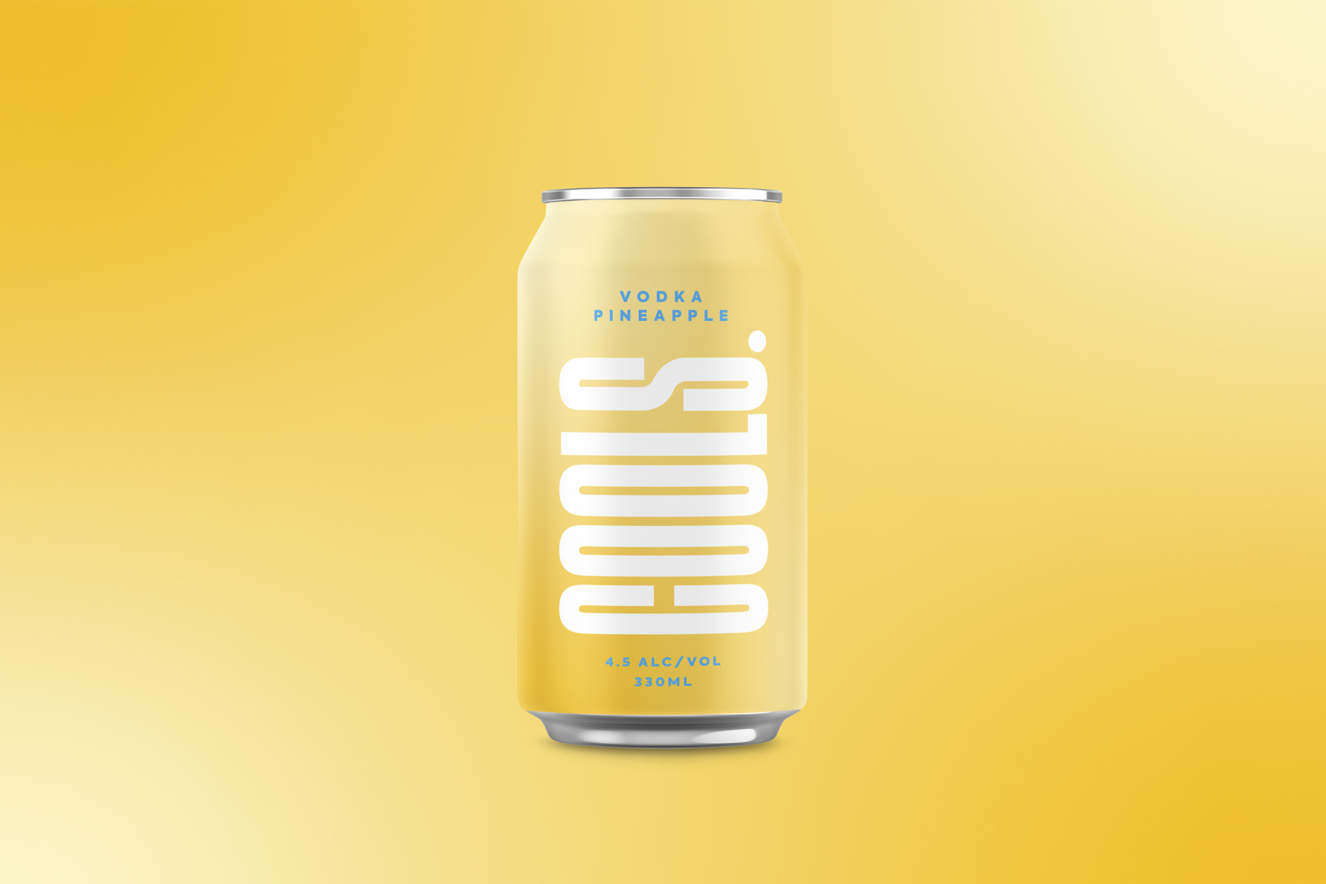
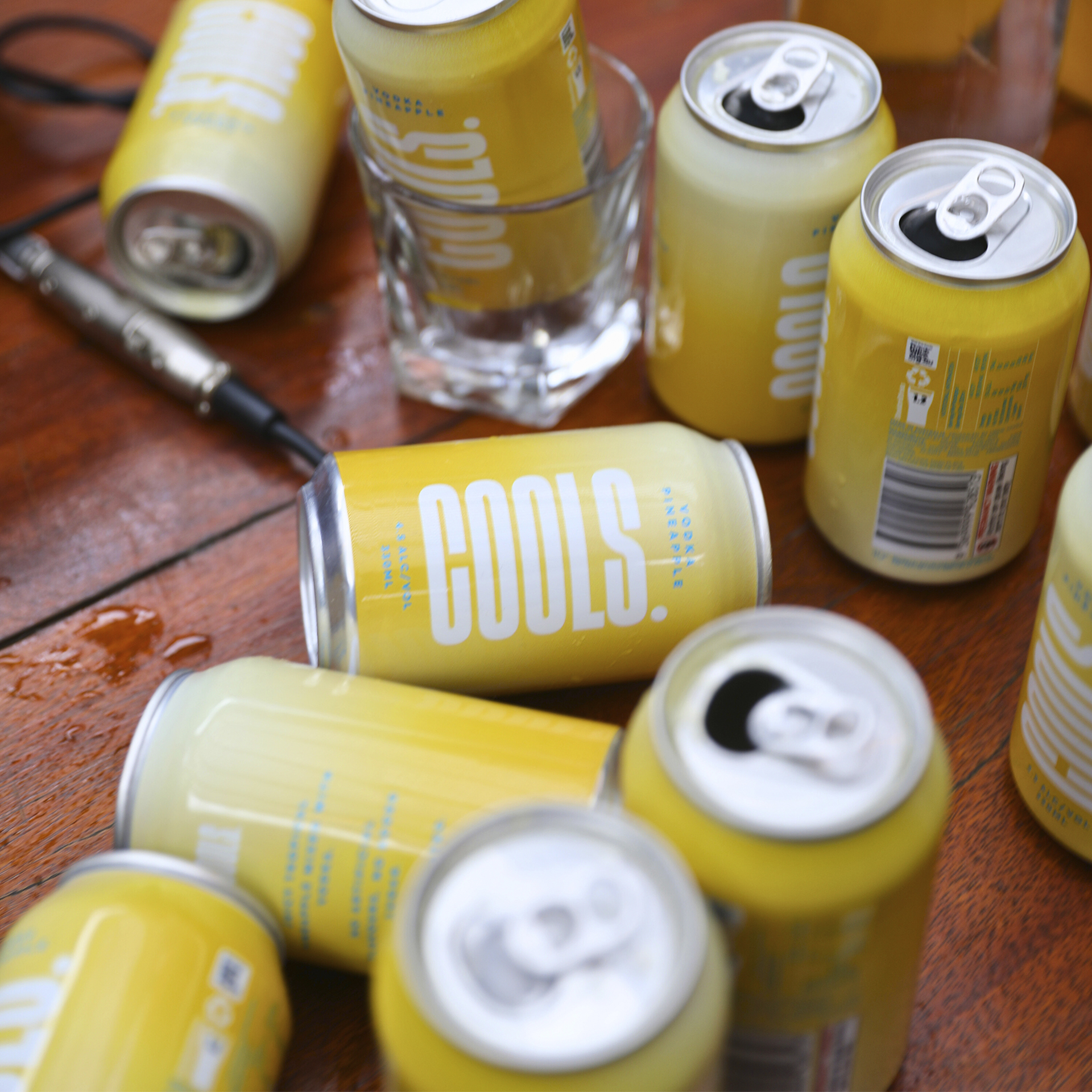
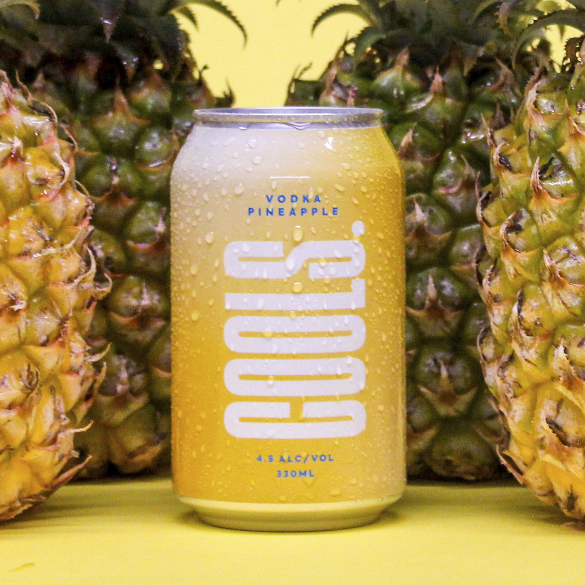
The Cools brand identity reflects that same intention: bold, clean, and stripped back. A vertical logotype anchors the can, asserting presence with quiet confidence. The soft yellow base evokes natural pineapple, while a crisp blue accent keeps things feeling fresh and modern. From the tactile finish to the uncluttered layout, the design is built to stand out, scale easily, and feel like nothing else on shelf.
Cools doesn’t shout, it speaks clearly. All flavour. No fizz. Just juice, done right.
Brand Design / Packaging Design